Cindy Sherman
1. Critique the
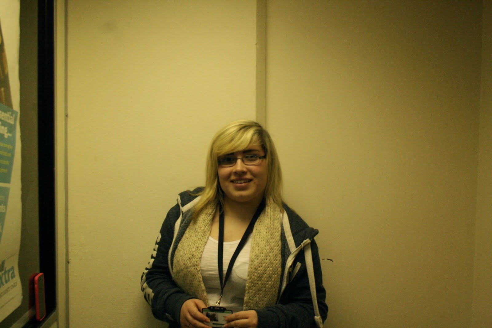
technique.
Exposure.
Is any area overexposed or underexposed? If so, can you say why you think that
happened? How could the photographer prevent this problem in the future?
I think that the exposure in this image is slightly over exposed as the person looks slightly washed out as it looks a bit bright. A way the photographer could prevent this in the future would be to make the exposure lower.
Focus.
Is the main subject in focus? Is it sharp focus, or a "soft" focus?
Is the focus appropriate for the situation?
The main subject in this image is not in focus, I personally think the focus on this image is soft but it is appropriate for the situation.
Depth of Field (DOF).
Is the DOF shallow or deep? Does the DOF work in this shot, or should more (or
less) of the photo be in focus?
I don't think the depth of field of this image is shallow, I think its kind of deep, this is because you can see the background clearly so its not shallow or you would not be able to see the background as clear as you can. The DOF in this image works, I think this because if the focus was just on the person and you could not seen the background I don't think the image itself would work, but I do think there could be a little more focus on the main subject being the woman.
Lighting / White balance.
Is the light soft or harsh? Does the type of lighting enhance or detract from
the things in the photo? Is the white balance set correctly? Is there a
yellowish, orangey, or greenish cast to the photo?
The lighting in this image is harsh, I know this because there is a shadow, soft lighted photographs don't have shadows, I think this type of lighting enhances thins in this image.
2. Critique the composition.
Centred vs. "Rule of Thirds".
Is the main subject in the centre of the frame? Is it on a third? Somewhere
else? Does the chosen composition work, or would you have done something
differently?
The main subject is in the centre of the frame, it does appear to be on a third, the chosen composition of this image does in fact work very well, I would of don't nothing different as a generally like this image
Fore, Middle, and Backgrounds.
(Most applicable to landscape photos) Does the photo contain all three? If not,
do you think it would be better if it did?
This image has a foreground, begin the main image, and a background being the wall, I think having a middle ground would make the image better.
Cropping/Framing.
Is there wasted empty space is the photo? Should the crop have been tighter? Is
it cropped so tightly that important parts of the photo have been
cut-off?
I think the only wasted space would be the top, above her head I think its an unnecessarily large gap, I would make he crop on tis tighter at the top but maybe wider on the sides.
Colour / Tonal Range.
What type of colours do you see? Did the photographer use many primary colours?
Secondary? Complementary? Are the colours too vivid? Not vivid enough? If you
are looking at a B&W photo, is there a true black, true white, with a large
tonal range in between, or is the photo too "grey"?
I don't think there is no true black or white in this image, the black is a bit dull and the white a bit off coloured and also dull. This photo is too "grey", the only true black is her jacket but it appears that is not the only black thing in the image.
Diagonals, S-Curves, etc.
Did the photographer make use of any visually interesting elements, such as
diagonal lines or S-curves?
I don't think there are any S-cuves but I do think there is one diagonal line, that being her leg.
Leading lines.
Do the lines and overall composition make you want to look deeper into the
photo? Is your eye drawn into the photo, or out of it?
The lines and composition do not make me want to look deeper, my eyes are drawn into the photo but not kept there, this is because of the line away from the main subject. The triangles on the subject make your eyes stay but after a while you start to look at her shadow, the floor, the wall.
Dark vs. Light areas.
Are there too many bright areas? Too many dark areas?
There is a even amount of dark and light areas but they are not too dark nor too light.
Balance.
Is the photo "balanced"? Would it be better if there were other
objects or other light/dark areas in the frame to improve the balance? If the
photo is off balance, is there a reason for it?
I think the image is balanced, there could be other subjects involved in the image but I think that would throw the balance of the image.
3. How does it
make you feel?
What mood do you see in the photo?
When look at this photo I see the mood is calm I think this because the subject looks calm, she's just sat there smoking a cigarette, nothing is involved in the image its just her on her own so nothing is bothering her.
Do you think this mood is what the photographer intended?
I do think this mood in intended as I don't think there could be another mood intended in this photograph. If there is I fail to see or find the other mood, so if there is another image then the photographer needs to make it clearer as it is no shown in this image.